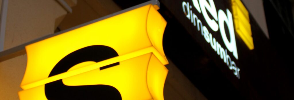
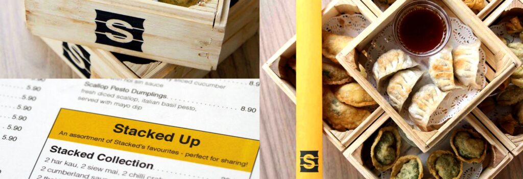
Stacked Dim Sum Bar
Why Restaurant Logo Design Is More Than Decoration
At Alchemist Studios, nestled in the picturesque yet creatively dynamic heart of Henley-on-Thames, we serve a sophisticated London clientele. We see restaurant logo design as far more than decoration. It’s the essence of a culinary experience. A strong logo ignites appetite. It signals flavour, communicates atmosphere, and builds an instant connection with potential diners.
In a fiercely competitive gastronomic world, every meal is a performance. Every impression counts. So, enduring restaurant logo design isn’t just an artistic flourish — it’s a strategic asset. It shapes perception, attracts the right patrons, and inspires memorable dining experiences. The best way to build a strong restaurant brand is through logo design that captures your story and speaks directly to your audience.
Building on a Strong Concept
Design legends like Paul Rand distilled complex ideas into elegant simplicity. Firms like Pentagram built meticulous brand systems on the same principle. Effective restaurant logo design follows this same discipline: it doesn’t just display a name.
Instead, we draw inspiration from culinary experience, industry trends, and each brand’s own story. Our job as designers is to distil a restaurant’s essence into a single, compelling mark. This mark should resonate with diners before they’ve even sat down.
A great logo whispers of fresh ingredients, unique cooking methods, or comforting nostalgia. It can just as easily hint at adventurous new flavours. Think of it as the silent maître d’ of a brand’s narrative. It quietly speaks to gourmet dining, casual comfort, ethical sourcing, or international authenticity, all within one compelling image.

Beyond the Menu: Asking the Right Questions
Restaurant logos often default to literal depictions: forks, knives, chef hats, or generic food illustrations. These can work well. However, used without real thought, they become visual cliché. Worse, they rarely help a brand stand out in a saturated, emotionally driven market.
Agencies like Landor & Fitch and Chermayeff & Geismar & Haviv take a different approach. They begin with strategy, not imagery. Before any sketch or typeface, we ask five core questions in our restaurant logo design process:


- What is your core culinary identity? A Michelin-starred fine-dining room, a bustling casual eatery, or an authentic international kitchen each demands a distinct visual language. So does a street food stall or a health-focused café. The right icon matters: a fork, a bowl, or a chef’s hat, chosen deliberately rather than by default.
- Who is your target diner, and what draws them in? Some diners want an exclusive gastronomic adventure. Others want a comfortable family meal, a quick bite, or a sustainably sourced option. Understanding their lifestyle and values shapes every decision that follows.
- What emotional connection are you building? Elegance, comfort, excitement, nostalgia, warmth, or community — whatever it is, the logo needs to carry that feeling instantly. A memorable tagline can reinforce it further.
- What’s your unique selling proposition? Maybe it’s a signature dish, a celebrity chef, your ambiance, or your sustainable practices. Whatever sets you apart, the logo becomes shorthand for it.
- Where will the logo actually live? Exterior signage and interior décor are one thing. Menus, napkins, and uniforms are another. Then there’s the digital layer: your website, social media, booking and delivery apps, and even branded merchandise like coffee cups and gift vouchers. The logo has to hold up across all of it.
Answering these questions properly turns the result into something more than decoration. Instead, it becomes an adaptive asset — one that communicates instantly, differentiates clearly, and builds the sensory and emotional connections that drive reservations and repeat visits.
The Alchemist’s Craft: Principles for Designing Restaurant Logos
Our approach at Alchemist Studios integrates classic design wisdom with a keen understanding of culinary trends, consumer psychology, and the powerful sensory experience of food. As a result, the restaurant logo design work we craft is both timeless and irresistibly appealing.
Appetite Appeal & Sensory Invitation: The Taste in the Sight
The most effective restaurant logos instinctively make the viewer hungry or curious. They hint at taste, texture, and aroma through judicious use of colour, form, and implied movement. Incorporating industry-specific icons, such as a bar, chef’s hat, or cutlery, can immediately communicate the establishment’s focus and attract the right audience.
Clarity & Readability: The Promise on the Façade and Screen
In a bustling street or a crowded online search, a restaurant logo needs to be instantly legible and understandable. The name and core message should be clear at a glance, without visual clutter. Adding taglines — short, memorable phrases — can further reinforce brand identity and help communicate your restaurant’s unique promise.
- Example: Nando’s: This popular chain’s logo, while featuring a stylised chicken, is primarily known for its vibrant red and warm colour palette. It’s coupled with a lively, almost hand-drawn font. It communicates energy, a bold flavour profile (Peri-Peri), and a casual, fun dining experience. The warmth of the colours directly stimulates appetite and excitement.

- Example: Dishoom (London): Known for its Bombay café experience, Dishoom’s logo often features a distinct, almost vintage-inspired typography. This typography evokes a sense of nostalgia and authentic Indian heritage. The visual identity extends to intricate patterns and a warm, inviting colour palette, contributing to the restaurant’s unique, immersive sensory appeal before a single dish is tasted.

- Example: Five Guys: Their logo is remarkably simple — bold, red, blocky typography. It’s direct, no-nonsense, and communicates a focus on straightforward, quality burgers and fries. Its extreme clarity ensures it’s instantly recognisable on their signature red and white interior, on signage, and across all digital platforms.

- Example: Pret A Manger: The handwritten-style, friendly typeface of “Pret A Manger” communicates naturalness, freshness, and approachability. It feels personal and authentic, aligning with their emphasis on freshly made, wholesome food. Its legibility across high-street signage and packaging is crucial for a fast-casual brand.

Personality & Storytelling: From Concept to Cuisine
A great restaurant logo imbues the establishment with a distinct personality. It hints at its origin story, its culinary philosophy, or the unique dining experience it offers. This often involves evocative imagery, handcrafted aesthetics, or sophisticated typography.
- Example: The Fat Duck (Bray, UK): Heston Blumenthal’s iconic restaurant uses a minimalist yet intriguing logotype, often with subtle, almost scientific typography. This reflects its avant-garde, experimental approach to gastronomy, where science meets culinary art. The logo’s understated elegance hints at a sophisticated and thought-provoking dining experience rather than overt literalism.

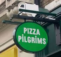
- Example: Pizza Pilgrims (London): This popular Neapolitan pizza chain uses a fun, playful, almost cartoonish logo featuring stylised pizza elements and quirky typography. It perfectly captures their informal, authentic, and joyful approach to pizza. The logo is an extension of their cheeky brand personality, appealing to a younger, casual dining audience.

Versatility & Ambiance: From Tableware to Takeaway
A restaurant logo must perform flawlessly across an unprecedented array of touchpoints. It needs to work as a finely embossed detail on a menu cover, a large glowing sign, a high-resolution image on a booking app, or a stamp on a takeaway bag. Therefore, this demands vector-based designs that can scale infinitely without loss of quality. They must also adapt seamlessly to different materials and contexts. Logos can also apply to merch such as uniforms, branded products, and promotional items, ensuring a consistent brand presence everywhere.
Consider a fine dining restaurant’s entire brand ecosystem. The logo needs to look impeccable when embroidered on a chef’s jacket, etched onto a wine glass, printed on a bespoke napkin, and animated for a website intro. The ability to maintain its integrity and prestige across diverse materials is key. For digital use, a transparent version (such as a PNG) is essential for seamless integration on websites and social media.
Ethos & Values: Communicating What Matters
In an era of conscious consumption, many restaurants leverage their logos to communicate ethical sourcing, sustainability, farm-to-table practices, or community engagement. This requires thoughtful design that authentically conveys these values.
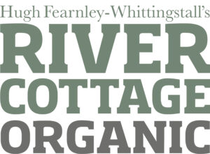
- Example: River Cottage (UK): Hugh Fearnley-Whittingstall’s River Cottage brand (encompassing restaurants, a cookery school, and products) typically uses rustic, naturalistic typography. It sometimes features simple, organic illustrations, like a pig or a vegetable. This design strongly communicates an ethos of local sourcing, sustainable living, and a return to wholesome, seasonal food. The logo feels authentic, down-to-earth, and trustworthy.

When creating your restaurant logo, you can pick from a wide range of designs, customize fonts, colours, icons, and layout, and generate a professional logo in just minutes using online tools. Many platforms offer free logo designs. Once you’ve found the perfect one, downloading different versions for various uses is quick and easy. Downloading your logo files gives you instant access to high-resolution, transparent, and multiple formatted versions, ready for use on everything from your website to merch and marketing materials.
The Designer’s Pantry: Choosing the Right Tools for Logo Creation
Creating professional restaurant logo design starts with having the right tools at your fingertips. Today’s restaurant logo makers offer a treasure trove of resources — think thousands of templates, a rich palette of design elements, and intuitive customization options. These make the creative process accessible to everyone. Whether you’re a seasoned designer or a restaurateur venturing into branding for the first time, a quality logo maker provides instant access to a vast library of icons, fonts, and colours. So, you can experiment and refine your vision until you achieve the perfect logo for your restaurant.
These platforms are designed to help you stand out from competitors by making it easier to create a logo that truly reflects your brand identity. With drag-and-drop simplicity, you can mix and match templates, add or edit icons, and fine-tune fonts and colours to match your restaurant’s personality. The best logo makers also offer professional-grade features. As a result, you can create a standout logo that looks as if it was crafted by a top designer, without the steep learning curve or cost. Ultimately, the right tools empower you to bring your restaurant’s story to life, ensuring your new logo is as unique and memorable as your menu.
The Secret Sauce: The Importance of Logo Files
Professional restaurant logo design isn’t just about how it looks — it’s also about how it works across every touchpoint. That’s where logo files come in. When you create your logo with a restaurant logo maker, you should receive a suite of logo files in various formats, each tailored for specific uses. SVG files, for example, are ideal for print materials and signage because they scale to any size without losing quality. PNG files, on the other hand, are perfect for digital platforms like your website or social media. They offer crisp, transparent backgrounds for seamless integration.
Having access to the right logo files ensures your brand always looks its best, whether it’s on a business card, a menu, or a billboard. A good restaurant logo maker will provide you with all the essential formats — SVG, PNG, JPEG, and more. This makes it easy to use your logo wherever you need it. Ultimately, this versatility is crucial for maintaining a professional appearance and ensuring your restaurant logo is always ready to shine, no matter the context.
Avoiding the Bitter Aftertaste: Common Mistakes in Restaurant Logo Design
Designing a restaurant logo can be a creative adventure, but it’s easy to fall into a few common traps. One frequent mistake is overloading the logo with too many design elements. Multiple icons, busy backgrounds, or an excess of colours can make the logo look cluttered and dilute your brand’s message. Another pitfall is neglecting scalability. A logo that looks great on a small business card might lose its impact or become unreadable when blown up for signage or digital banners.
To avoid these issues, focus on creating a simple, clean design that communicates your restaurant’s essence at a glance. Test your logo at different sizes to ensure it remains clear and effective, whether it’s on a tiny loyalty card or a large storefront sign. Many restaurant logo makers offer built-in tools to preview your design in various contexts. This makes it easy to spot and fix potential problems before they become costly mistakes. By keeping your design streamlined and functional, you’ll create a logo that’s both visually appealing and practical for every aspect of your business.
Serving with Style: Best Practices for Logo Usage
Once you’ve crafted your restaurant logo, the next step is to use it consistently and thoughtfully across all your brand touchpoints. From your website and social media profiles to print materials like menus, flyers, and packaging, a cohesive approach helps reinforce your brand identity. Consistency in colour, layout, and logo placement is key to achieving a polished, professional look that customers will remember.
It’s also important to consider how your logo will appear in different settings. For example, a logo that pops on a white background may need a different colour scheme or layout to stand out on darker surfaces or merchandise. The best restaurant logo makers provide a variety of logo variations — different colourways, layouts, and file types — so you can easily adapt your logo for any use. By following these best practices, you’ll ensure your restaurant logo always looks its best and supports your brand’s growth across every platform.
The Taste Test: Measuring the Success of Your Restaurant Logo
A great restaurant logo should do more than just look good — it should resonate with your customers and drive real results for your business. To measure your logo’s success, start by gathering feedback from your audience through surveys, focus groups, or informal conversations. Pay attention to how your logo performs on social media: are people liking, sharing, or commenting on your posts? Website analytics can also provide valuable insights, showing whether your new logo is helping to increase click-through rates or conversions.
Many restaurant logo makers offer tools and resources to help you track these metrics and gather feedback. This makes it easier to refine your logo and brand identity over time. By staying attuned to your customers’ reactions and monitoring your logo’s impact, you can ensure your restaurant logo continues to support your business goals. It should leave a lasting impression on everyone who walks through your door, or visits your website.
A Glimpse Beyond the Plate: The Future of Restaurant Logo Design
Restaurant logo design keeps evolving alongside technology and diner expectations. Logos are no longer purely static. Some now move, animate, or respond to interaction, creating a more dynamic brand experience both online and in person. Sustainability is shaping design choices too, with more brands opting for minimal, low-waste visual identities that reflect real environmental commitment.
Staying ahead of these shifts keeps a logo relevant for years, not just for one trend cycle. That’s exactly the kind of longevity we design for.
Alchemist Studios: Forging Your Restaurant’s Distinction
Designing a restaurant logo means capturing the essence of a culinary dream. We translate the passion of the kitchen, the warmth of the hospitality, and the uniqueness of the flavours into a single visual language. We’re not just designing symbols — we’re crafting invitations to dine, promises of quality, and emblems of unforgettable experiences.
What Our Restaurant Logo Design Process Delivers
Our process blends culinary insight with design excellence. As a result, every restaurant logo we create is:
- Strategically grounded — reflecting your culinary concept, target diner, and market position
- Visually appetising — inviting, memorable, and true to your desired taste, atmosphere, and emotion
- Experience-driven — built for seamless use across menus, décor, and uniforms
- Digitally agile — performing flawlessly across booking apps, delivery platforms, social media, and reviews
- Timeless and authentic — built to outlast food trends and build lasting loyalty
Whether you’re an ambitious chef launching your first concept, an established restaurant refreshing a beloved identity, or a multi-location group building cohesive recognition, thoughtful restaurant logo design can become the most powerful emblem of your dining establishment.
Contact Alchemist Studios today to discuss how we can build your unforgettable restaurant brand identity.