From Myspace and LinkedIn in the early 2000’s to Twitter and Instagram in 2012, social media usage has skyrocketed over the past two decades. Add smartphones into the mix around 2007, and brands were left with no choice but to rapidly adapt their digital content to meet a variety of new requirements – and logo design was no exception.
Impact of Social Media
Fitting the format
When businesses expanded their online presence to include social media, logos that had previously been effective on websites did not always transfer across effectively. With each platform offering its own format, different variations of the logo needed to be designed with social media in mind. This often involved taking elements of the existing logo and mixing them up or simplifying them.
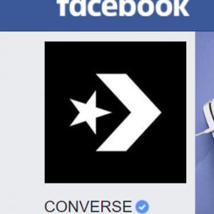
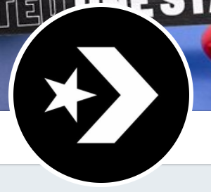
As seen below, a rectangular text logo would appear smaller and therefore have less impact in the square or rounded primary images on Facebook, Twitter and Instagram, and therefore an element of the logo was taken to represent the brand on social media.
- Converse Facebook logo
- Converse Twitter logo
- Converse Instagram logo
Getting down with the kids
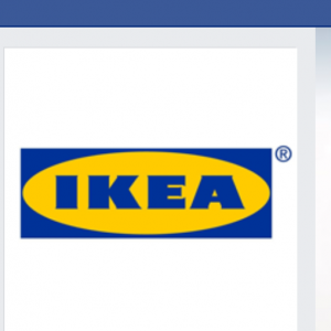
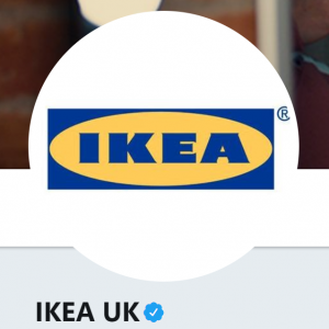
In order to engage directly with their customers and develop a friendly relationship, brands often aim to portray a more playful side of themselves on social media. This attitude can translate to custom logo design, whether that’s choosing a more contemporary font, or creating a simple bold logo that’s instantly recognisable. It’s worth bearing in mind as well that social media platforms tend to have a younger age demographic than more traditional forms of media. The most effective logos for social media are simple, bold designs without words, typically using one or two colours and an icon portraying a vital element of the brand, as shown in the above example. Shown below is a brand who’ve chosen to force a logo onto social media without considering the formats of the platforms.
- IKEA Facebook logo
- IKEA Twitter logo
Apps and designing for menu screen
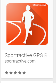
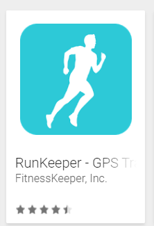
Hand in hand with smartphones came apps, providing more restrictions for a business’s app logo. Apps are square spaces with rounded edges, and provide only a few millimetres to represent your brand, in amongst pages full of others. Complicated logos would look cluttered in this format, and so a simple design which is instantly recognisable and stands out from the crowd is best. Remember to do your research before coming up with a logo design for an app, as some designs are already overused.
Logos that work in different viewports and ratios
Logos were designed with scalability in mind even before the internet, for example considering how a logo would look on a billboard vs a leaflet. Today this is more important than ever, with users choosing to work on a variety of devices such as macs, PC’s, tablets, laptops and smartphones. With different screen sizes, and web browsers being changed in size or shape, it’s crucial that a logo can hold its own and adapt to a variety of different viewports and ratios, for optimal user experience. One approach is to create a suite of varying sized logos to be served at different fixed viewports. However, it’s worth considering the more scalable solution of using Scalable Vector Graphics (SVGs). Unlike bitmap formats such as JPEG, SVG’s are truly scalable and lossless in quality as they’re resized. Some of the advantages of choosing an SBG format are:
- SVG’s scale without loss to any size
- Look sharp on retina displays
- Support all resolutions
- More futureproof than JPEG as will support resolutions not yet in common use
Logos that adapt to shrinking menu
Always seeking to provide the best user experience possible, websites often have shrinking menus which travel down the page with the user. The bar tends to have a set background colour for clarity. Therefore, its necessary to consider how a logo will scale down for a shrinking menu as well as how it will stand out from or match the background colour of the menu bar.
Favicons
Favicons are the small icons associated with a brand which appear in the websites address bar and bookmarks. These are the smallest of all logos and so are typically made to be as simple as possible, as they’re just a few millimetres in width and height. Simplifying the logo and using the same colour scheme can be a good place to start. As most web browsers use white or cream tabs, making a Favicon bold and visible on these colours is crucial, for example see how the Converse logo’s colours are reversed in the Favicon for this purpose.
With a saturated market, creative, original logo designs and strong branding are more important than ever, with recognisability, visibility and adaptability being areas of primary importance. If you’re looking for an experienced London-based logo designer you can get in touch with us.


