The concept of a logo is almost as old as time. Logos can trace their history back over several thousand years to the time of the Ancient Egyptians, who were known to mark their animals with hieroglyphs to prove ownership. The great faiths of the world have all adopted symbols for ease of recognition. A few thousand years later, the Ancient Greek rulers and their dynasties used cipher as a monogram in their coins.
In the UK, while farmers would mark their stock, they used colours agreed amongst themselves rather than a symbol and coins that only had the royal profile on them. Yet the Great Barons of our small island were very clear that they wanted their “brand” to be as well-known as the Ancient Greeks had. Their first iterations were the coats of armour to reflect which Great Baron you were fighting for. When people saw the Baron’s men ride into town, their livery and badge was instantly recognisable. It reflected the power, wealth and status of the man at the top. The same is true of the corporate logo.
Corporate logos, on the other hand, were more like trademarks. They date back to the early days of the 13th Century. Goldsmiths, masons, paper makers, and potters, were among the first trades to use marks-pressings into gold, etched or stamped symbols, watermarks on paper, and simple thumb-prints on pottery.
From the 1600’s onwards text advertisements began to appear in newspapers in the UK, however, it was not really until the start of the 20th century and the introduction of colour printing and the birth of the advertising industry, that logos really came into play. As the population already understood that religious and heraldic symbols stood for dignity, beliefs and status, it was not too much of a stretch to add these values to products.
Logos were still primarily text based, yet supported by images and outrageous claims. For example, the alcohol and tobacco industry used images and vocabulary which indicated a happy and healthy lifestyle.
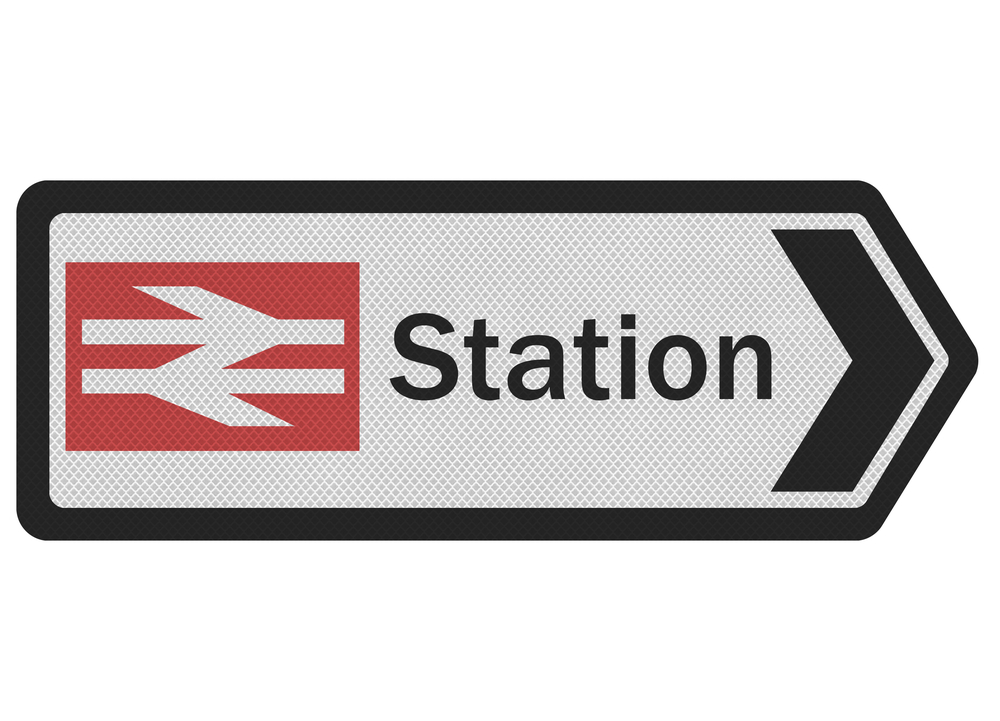
Ironically, as our lives have sped up, the glorious heraldic based imagery and flowery fonts have been replaced by increasingly simple icons. The evolution of the British Rail throughout the 20th century clearly demonstrates this effect. In fact, the art of logo design illustrates the design concept “Less is More” better than any other graphic form. Research has shown that a known, icon based logo can be recalled after being shown for a thousandth of a second.
![]()
![]()
Naturally, we would feel that your best option is to employ a logo specialist to produce the perfect logo for your company, as there are some wonderful examples of Logo Fails floating around on the internet (Click on https://www.boredpanda.com/worst-logo-fails-ever to see what we mean).
So, in a nutshell, for a successful logo, you need a strong, clear visual identity, instantly recognisable and representing your company’s core values and product offering. Take a look at our logo portfolio to see some of the ones we have developed recently.