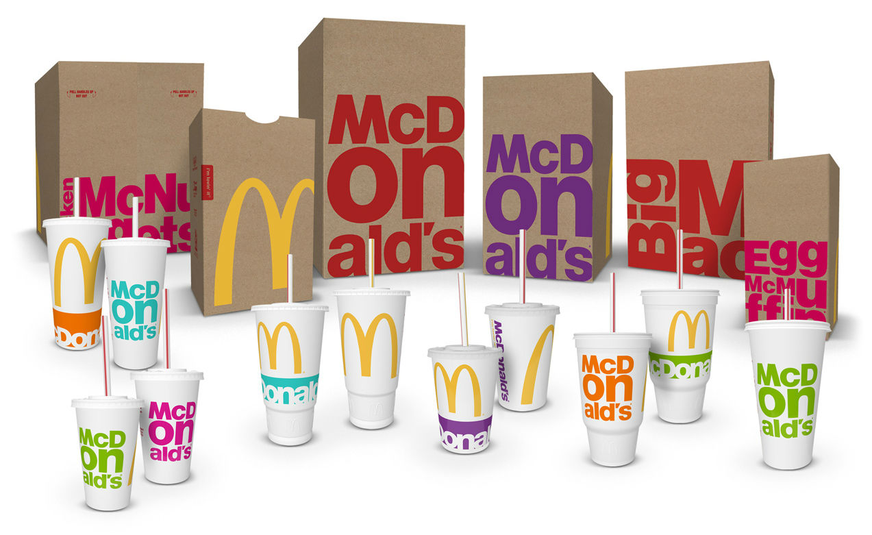
2016 saw some really interesting trends in graphic designs. We’ve put together a short list of some of the trends that we predict will continue to grow in 2017.
Minimalism and keeping things simple
Keeping things simple has always been important in graphic design – but never more than it is now. Graphic designers need to consider how their designs are going to look on the increasing number of smaller devices; tablets, mobiles and smart watches. Flat design was a prominent factor in 2016 and was influential in the minimisation of loads of big brands.
Coop
Mastercard
Bright and intense colours
Colours became a lot less muted in 2016. Instead designers were choosing to go for bold and bright colours. Pops of colour were often used to create contrast and intensity. We think there will be an increase in monochromatic colour overlays – in keeping with the minimalistic trend.
Fun and bold typography
 2016 saw an array of playful and bold styles of typography. Watercolour typography was used a lot on the web with some really great results.
Broken bold prints were also experimented with:
What’s going to be big in graphic design in 2017?
Still keeping things simple…
2017 is going to see is an increase in functionality over style and design. Keeping things as sleek and minimal as possible to focus on the product or service. Logos, websites and packaging are likely to reflect this trend throughout the new year.
If you’re looking for some support in any aspect of graphic design; be it branding, logo design or web design please don’t hesitate to get in touch. We have years of graphic design experience and love keeping up with current trends in the industry. This helps us to create the best and most relevant designs for our clients.


