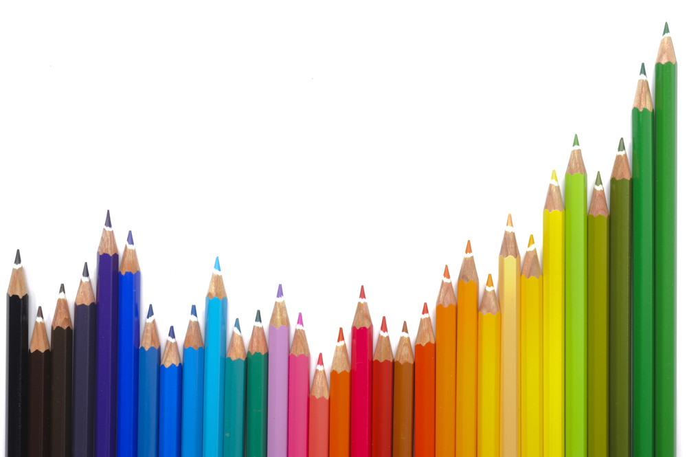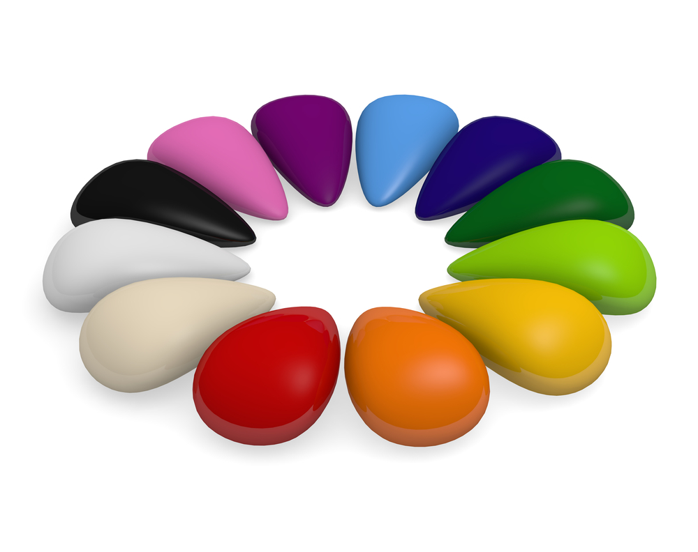
The idea that colour is linked to emotion is not new. Artists and designers have long understood that colour can dramatically affect moods and emotions for a millennia.
Our reaction to certain colours is cultural; for example in the West, the colour white is associated with purity and peace (white weddings and doves) whereas in the East it is the colour of mourning. Some may argue that in the East, the belief in the afterlife and new beginnings associated with leaving this world and arriving to the next one as a born again soul are similar, however it is a bit of a stretch.
Our emotional reactions connected with certain colours are hard wired into our psyche. If we were to see a bright red bug, snake or frog in the wild, we would instinctively avoid it. So colour is a powerful communication tool both in terms of nature and the modern world. We use colour all the time, subconsciously to indicate status, attitude and desire.
In terms of colour as a design tool it can be used to signal action, influence mood, and cause physiological reactions towards the message that the company is trying to portray. We all have a favourite colour. Yet what does a colour say about your brand?
Black
Prestigious, expensive, elitist and serious. Black is the colour of power, which is widely used in the world of high end designer goods – think of brands like Chanel, Prada, Dolce and Gabanna. So when relative newcomer, Jo Malone came along with her expensive hand cream, which colour did she use for her logo – Black; clean, strong, simple and exclusive.
Red
Yes, its nature’s colour for passion and danger, however did you know that it also stimulates feelings of hunger in carnivores and omnivores? Think about the big food manufacturers; McDonalds, KFC, Pizza Hut, Kellogg’s, Heinz and Coca-Cola; they didn’t choose red as their logo by chance.
Green
Obviously, during an election year you cannot fail to notice the environmental message associated with this colour. It is a colour of nature and harmony. It is supposed to have a calming healthy feel too. Which is why most animal or nature charities will migrate towards it; similarly it is why some petrochemical companies have chosen it too, for example BP – their aim being that they want to look “less bad” than their competitors in terms of planetary impact.
Yellow
Yellow is a “marmite” colour. Instinctively you think of a warm sunny day, however your subconsious has a different view, it means urgency. For those who have a product which they want to be considered as fast and dynamic, a bright yellow is often selected, think about Ferrari, Nikon, UPS or Yellow Pages. If you think about Ikea does the idea of a leasurly stroll spring to mind? I doubt it.
Orange
If you want calming cheery sunshine, orange is the colour which your subconsious will link to. Its bold, sunny, optimistic and confident. Companies who wish to look warm, kind and friendly tend to choose this colour ( amazon’s smile or even Sainsbury’s) they want to feel like a “family” place with family values.
Blue
Why do most IT companies choose this colour? Facebook, Dell, HP, IBM GE, LG even NASA have chosen blue. It is all about trust. Blue creates a strong, reliable emotion, which is why men often choose blue clothes, suits or shirts as office wear – they want to look strong, trustworthy and dependable. It is also worth noting that both of the world’s biggest car manufacturers have blue logos too – Ford and VW.
Rainbows

However if you want diveristy then you need a rainbow. Microsoft, Google, NBC and even ebay all use strong mixed colours. They are looking for reach and mass market appeal. There is nothing niche or exclusive about their offering, they want everyone, everywhere for everything.
So when you consider the elements within your corporate logo, consider what it says about you and the image you wish to protray. If you want to know more about how the colours in your logo effect consumer reatction talk to us here at Alchemist Logo Design.
