Coriander Lime Kitchen is a the only Asian cookery school in the region of Taupo, New Zealand. They offer weekly group classes as well as private lessons in addition to small private events.
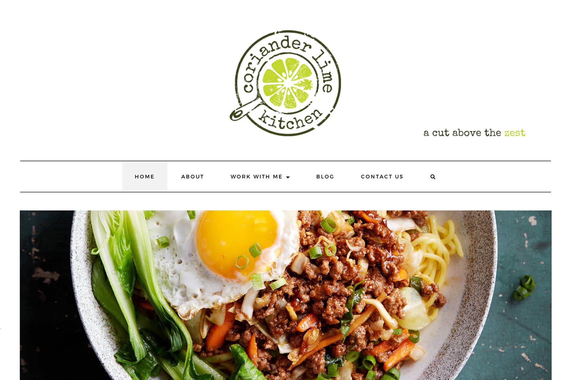
The logo design is simple, yet effective. When contemplating logo designs, a circular design was selected as this allowed a pan to become part of the design, something synonymous with cookery. Furthermore, through incorporating the lime into the cooking pan, the brand’s identity and message can be fully showcased. The lime green colouring symbolises health, which is something the company advocates, and also stands out in contrast to the white pallet of the rest of the logo .
The strapline ‘A cut above the zest’ is a humorous play on words and delivers a sense of fun – cooking is meant to be fun and enjoyable, and with this strapline it will leave customers with a positive tonality in mind. It also reinforces the brand name through referring to the lime, as well as indicating the brands superiority in their marketplace.


