

Last Eight
At Alchemist Studios, we understand that a truly effective logo is more than just an image. Indeed, it’s the visual distillation of an entity’s essence. Music is a vibrant, ever-evolving world where fleeting trends often dominate. Because of this, creating an enduring music logo demands a strategic, insightful approach — one that transcends the momentary and embraces the timeless. There is a real risk in relying on generic or trendy designs. These can undermine credibility and fail to stand the test of time. So, a thoughtful approach to music logo design helps mitigate that risk. Overall, music logo designs are a crucial aspect of branding for musicians, bands, and music-related businesses. They help establish credibility and showcase a unique musical style. What’s more, with current technology, musicians and music professionals can create a professional logo in just a few minutes, making the process more accessible than ever.
Much like the iconic work of Paul Rand, who stripped away the superfluous to reveal a brand’s core, a successful music logo doesn’t shout. Similarly, the same is true of the elegant simplicity championed by Massimo Vignelli. Instead, it resonates. Furthermore, it’s a fundamental element of a comprehensive brand identity, working in harmony with the sound it represents rather than trying to overshadow it. So, if you’re ready to get started, it’s easier than ever to create your own logo today using modern logo makers and design tools.
Moving Forward
The temptation in music logo design is often to lean on literal musical iconography: clefs, notes, instruments. While these can play a role, using them without much thought can lead to generic, forgettable marks. As designers at Pentagram or Landor & Fitch would attest, true branding genius starts with the why. Only then comes the what.
Before a single pixel is placed, we embark on a journey of discovery. Specifically, we delve into the artist’s or band’s narrative, their creative philosophy, and their aspirations.
Who Is the Artist or Band?
What is their genre, their ethos, their unique selling proposition? Are they a gritty rock band, a sophisticated classical ensemble, an avant-garde electronic artist, or a soulful singer-songwriter? What kind of narrative do they wish to convey? Different types of music logos exist — iconic, textual, or combined. Each often suits specific genres and branding needs better than others. So, choosing the right type is essential for effective communication.
Who Is Their Audience?
What are their demographics, their psychographics, and their expectations? How do they connect emotionally to the music? Understanding how colours and design elements affect people is crucial to the design process. For instance, a logo for a punk band will naturally differ from one for a folk artist. This is because artists in each genre tend to choose visual styles that resonate with their audience.
What Is the Core Message?
What feeling, emotion, or story does their music convey? This is where the magic happens: translating an auditory experience into a powerful visual statement.
Where Will the Logo Live?
Think album art, merchandise, social media profiles, concert backdrops, and streaming platforms. Versatility and scalability are paramount here. After all, a logo must work as effectively on a stadium screen as it does on a pin badge or a tiny app icon.
This strategic grounding, reminiscent of the comprehensive identity work by Chermayeff & Geismar & Haviv, ensures the resulting mark is not merely decorative. Instead, it becomes a powerful asset that communicates, differentiates, and connects on a deep emotional level.
The Art of Distillation: Principles from the Masters & Icons
Drawing inspiration from the giants of design and the enduring legacies of music’s visual identity, here are the principles that guide our approach to crafting impactful music logos.
- Simplicity is King (and Queen): As Sagi Haviv often emphasizes, a logo should be easy to understand, reproduce, and remember. Overly complex designs get lost. The most effective logos, in music and beyond, achieve impact through economy of form. Designers can add elements like a tagline or an icon to further enhance a music logo, but should do so with restraint to maintain clarity.
- The Beatles’ “Drop-T” Logo: A perfect example of simplicity. Designed by Ivor Arbiter in 1963, this seemingly straightforward wordmark, with its iconic elongated “T,” became instantly recognisable. Its clarity and directness perfectly mirrored the band’s initial no-nonsense rock and roll appeal, ensuring memorability without relying on complex imagery.
- Memorability Through Uniqueness: In a crowded industry, standing out is crucial. A truly memorable logo possesses a unique characteristic that allows it to stick in the mind. This doesn’t necessarily mean being outlandish; often, it’s a subtle twist, a clever negative space, or an unexpected juxtaposition that makes a mark unforgettable. Additionally, when evaluating your logo, consider experimenting with different layouts and design elements to ensure your logo is distinctive and memorable.
- The Rolling Stones’ “Tongue and Lips”: Designed by John Pasche in 1970 (reportedly inspired by Mick Jagger’s own lips and the Hindu goddess Kali’s protruding tongue), this logo is the epitome of unique rebellion. It’s provocative, instantly recognisable, and perfectly embodies the band’s audacious, anti-establishment spirit. Its sheer distinctiveness has allowed it to transcend the band itself and become a global cultural icon.
- Timelessness Over Trendiness: Trends fade, but great music endures. The most effective music logos are designed to last, resisting the temptation of ephemeral design fads. A timeless logo, much like a classic album, retains its power and relevance for decades.
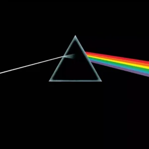
- Pink Floyd’s “Dark Side of the Moon” Prism: While an album cover rather than a standalone band logo, Hipgnosis’ iconic prism design for Pink Floyd (1973) is a masterclass in timeless abstraction. It’s simple yet profound, perfectly capturing the album’s themes of introspection and the dispersion of light (and life’s experiences). It remains instantly identifiable with the band decades later, proving that abstract, conceptual designs can achieve enduring iconic status.
- Versatility and Adaptability: A logo for a musician or band must thrive across a multitude of applications. It should look strong in monochrome, scale effortlessly from tiny avatars to massive stage backdrops, and remain legible whether printed, embroidered, or displayed digitally. This often means designing a robust primary mark with potential lockups or variations for specific contexts. Always check how your logo appears across different platforms and applications to ensure it maintains its impact and clarity everywhere.
- Run-DMC’s Bold Wordmark: Created by Stephanie Nash in 1986, the Run-DMC logo is a prime example of a versatile, impactful wordmark. The use of Franklin Gothic Heavy, set within two thick red bars, provided a tough, unapologetic, and instantly recognisable identity. Its simplicity allowed it to be effortlessly replicated on merchandise, album covers, and stage sets, becoming synonymous with the golden age of hip-hop.
Relevance and Personality
While avoiding cliché, a logo should genuinely reflect the artist’s identity and musical style. A heavy metal band’s logo will naturally carry a different visual weight and attitude than that of a jazz quartet. In short, it’s about capturing the essence, not just illustrating the genre. When you use a logo maker, many platforms let you create and download music logos for free. This makes the process accessible for artists at any stage.
Example: Queen’s “Queen Crest.” Freddie Mercury, a trained graphic designer, designed this crest himself shortly before the band’s first album in 1973. It’s an elaborate emblem that embodies Queen’s regal, theatrical, and ambitious persona. Incorporating the zodiac signs of the band members — two lions for Leo, a crab for Cancer, and two fairies for Virgo — it’s a deeply personal and visually rich symbol. Together, these elements speak to the band’s unique blend of rock, pomp, and grandeur.
A Rawer Kind of Personality
Example: Nirvana’s “Smiley Face.” Attributed to Kurt Cobain, this crude, slightly deranged yellow smiley has X’d-out eyes and a hanging tongue. It captured the band’s blend of angst, irony, and anti-establishment sentiment. Overall, it’s simple and unsettling, and it resonates deeply with the grunge aesthetic it came to represent.
The Power of Type
For many musicians, a strong wordmark is the logo. The choice of typeface, its customisation, and its relationship to any accompanying symbol can convey personality, genre, and attitude with real power.
Example: Wu-Tang Clan’s “W.” Designed by the group’s DJ and artist Mathematics, the “W” logo is instantly identifiable. It evokes the raw power and complex philosophy of the hip-hop collective. Its sharp angles and aggressive posture communicate strength and unity, along with a nod to martial arts aesthetics that defined their brand.

When using a logo maker, simply enter your keywords or business details. This quickly generates a range of music logo options tailored to your needs. Indeed, creating a new logo for your music brand is exciting. It marks an important step in building your identity. What’s more, a well-designed logo can inspire love and admiration from your fans, helping to forge a strong emotional connection. Ultimately, the goal is to find a logo that fits your artistic vision and stands out in the industry. In the end, there’s real satisfaction in having a professional music logo in hand, ready to use across all your branding and marketing materials.
Versatility
A truly effective music logo is one that adapts effortlessly to every stage and platform your brand encounters. Whether it’s gracing a tiny app icon, a sprawling festival banner, or the sleeve of your latest album, your logo needs to be both simple and effective. In other words, it should instantly communicate your message no matter the size or medium. Overall, scalability and versatility are essential design elements here, ensuring your logo stands strong in any context.
When creating your music logo, consider developing multiple versions. For example, try a horizontal layout for website headers, a vertical version for social media, and a simplified icon for merchandise or digital avatars. Each version should keep the core identity and message of your brand. This way, your logo can stand on its own without losing impact. With a music logo maker, you can easily create, adjust, and download different versions as your needs evolve. This flexibility, in turn, ensures your logo stays consistent and recognisable across all platforms, helping your music brand communicate clearly and resonate with audiences around the world.
Alchemist Studios: Composing Your Visual Identity
At Alchemist Studios in London, we understand that your music is your voice. Our mission is to give that voice a powerful, resonant visual identity — one that speaks volumes without uttering a sound. We don’t just design logos. Instead, we craft strategic visual assets that amplify your artistic message, connect with your audience, and stand the test of time.
Perhaps you’re an emerging artist seeking to make your mark, an established band looking to refresh your image, a record label forging new paths, or a music-related business aiming for distinctive branding. Either way, we invite you to explore how a thoughtfully designed logo can become the cornerstone of your brand’s visual symphony.
So, let’s collaborate to create a mark that not only complements your sound but becomes an unforgettable icon in its own right, resonating with audiences for generations to come.
Contact Alchemist Studios today to discuss how we can compose your unforgettable brand identity.
Brand Consistency in Every Movement
Branding is a symphony, and your music logo is the recurring motif that ties every movement together. Consistency is key. Your logo should look the same whether it’s on a social media profile, a concert poster, or a piece of merchandise. This visual harmony builds trust and recognition, making your brand instantly familiar to fans and potential customers alike.
Using a logo maker streamlines the process of maintaining this consistency, letting you create and manage your music logo across all platforms with ease. Pair your logo with a cohesive colour scheme and typography to reinforce your brand’s identity, so every touchpoint reflects the essence of your music. Remember, your fans and community are at the heart of your brand. By creating a logo that resonates with them, you foster a sense of connection and belonging. Over time, this turns casual listeners into loyal supporters. Ultimately, a memorable, appealing music logo doesn’t just represent your sound. It becomes a symbol of the shared experience between you and your audience.
Measuring Success and Evolving Your Logo
The journey doesn’t end once you’ve created your music logo — true branding is an ongoing process. To keep your logo effective, it’s important to measure its impact. Track engagement on social media, monitor merchandise sales, and listen to feedback from your fans. These insights will help you understand how your logo is resonating in the music world, and whether it’s achieving your branding goals.
With tools like LOGO.com’s music logo maker, making alterations and updates to your logo is easier than ever. As your brand grows and evolves, don’t be afraid to refresh your logo to reflect new directions or trends. Just be sure to maintain the core elements that make your identity unique. Stay attuned to your audience and the ever-changing landscape of music and design. This is how you keep your music logo relevant, effective, and memorable. So, start building your brand’s identity today: create your own music logo and let your visual story play on for years to come.
Logo Design Portfolio London – Alchemist Studios