COMPANY:
The Dempsey Brasserie
DESCRIPTION
Restaurant
LOCATION:
Singapore
DESIGN:
Logo + Miscellaneous
Click to expand images
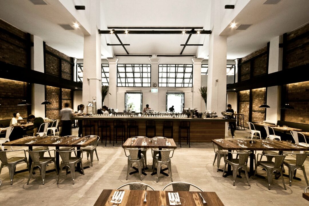

Meatpacking district inspiration gets unpacked in old Singapore army barracks.
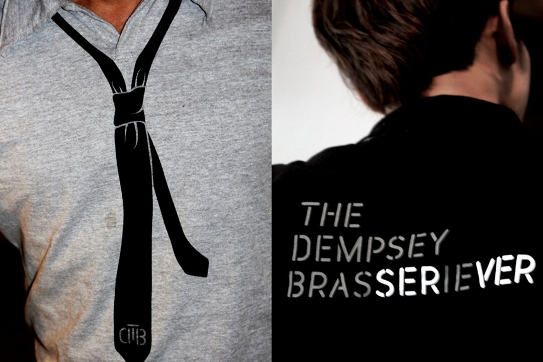
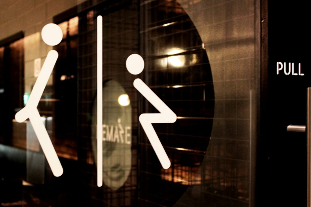
The Dempsey Brasserie is housed in what was an old army barracks. Taking that military inspiration, we developed a unique typeface for the project by taking a contemporary font and adapting it into a stencil-like construction that would often be used on military paraphernalia.
The interior design utilised a muted colour palette of natural materials, blacks and greys, which we carried through into the branding.
Although the final logo may look relatively simple, the strength of the overall branding came from the distinctively created alphabet of letters which were then applied to all written communications required for the brasserie – giving the brand its own instantly recognisable graphic language.