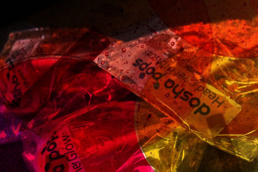


Healthy lollipops that refreshingly don’t suck!
Dosha Pops is a boutique company that creates unique lollipops and organic herbal tea infusions based in New York City. These lollipops are designed with a person’s Ayurvedic Dosha in mind, which refers to the theory that health exists when there is a balance between the three fundamental bodily bio-elements or doshas called Vata, Pitta, and Kapha.
When designing the logo for Dosha Pops, we wanted to introduce a design that reflected the health benefits of the product, incorporated in a clean and eye-pleasing design with a bold text font. It was paramount to deliver the core message of health in the logo to ensure customers would instantly realise that the product is a healthy option. The leaves that spiral off the logo achieve this vision, with the green colouring being synonymous with the term ‘organic’ and living a healthy lifestyle – which ultimately provides the perfect representation of promoting health, which fundamentally the company is all about.