As someone who happily lets sporting activities in all its forms pass me by it’s not often I become excited by anything from that world. Of course, I have moments of patriotism when England or team GB play something in an international stadium, but I am quite content with listening to the 5 minute summary on the news.
Naturally, I find the Nike tick an impressive device, along with their “Just do it” slogan, but that is where my interest ends. Sporting logos, like all others, are omnipresent in our modern lives. They are the old school crest of the sporting world. A badge of honour and pride which almost takes on religious levels of passion. So when an organisation as welded to the public consciousness as the Premier League create a new logo, everyone becomes a design expert.
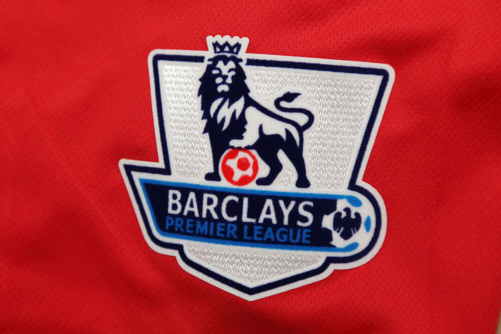
![]() The new Premier League logo, Source: Premier League
The new Premier League logo, Source: Premier League
On a personal level I do quite like it. There is a nodding reference to our heritage and that of the Premier League with the use of the Lion, the font is sleeker and more modern than its older counterpart. Having never sat down to watch a football match on TV, my positive view of this logo, based purely on logo aesthetics and font relationships is nothing compared to those of the passionate fans who voiced their contempt on Twitter and other social media platforms.
I have a slightly different view of the Beautiful Game than many of my colleagues. I am often told that if I went to watch a match, live, the vibe in the stadium would give me a huge buzz and the mass hysteria of team comradery would cause an epiphany in my thinking! Well the cost of a ticket prevented any hit of an epiphany occurring.
As most enthusiasts of the sport will know, Barclays Bank announced back in 2014 it would not renew their £40m-a-year deal in the wake of the sexist emails scandal, just to remind you Premier League chief executive Richard Scudamore sent and received emails, in which women were referred to as ‘big t***ed broads’, so the bank, which after its own multiple scandals, had decided to distance itself from the League. Mind you, Sky and BT Sport are now paying a record £5.1billion for TV rights from the start of the 2016 season, so it might equally be fair to say that Barclays feared the cost of the next sponsorship would also have risen considerably too.
Since their withdrawal, it was obvious that something had to be done about the Logo for the 2016 season, as their old logo clearly was no longer appropriate. Awash with cash from Sky and BT, it seems that the Premier League has voted not to have a sponsor for the 2016-17, however it is pretty clear that their new logo has been designed with the idea that, should they find themselves looking for a few coppers down the back of the sofa, a new name could be added at the last minute. As they say in the business – watch this space!